One of the important considerations when making your design is having a good typography. Typography is referring to the texts included in your design, whether it is an ad campaign or a brochure layout. It does not only pertain to font selection, although it is very important. It can also be about text placement and font styles and size variations. Typography is important because these are what the spectators of your design would be reading. Here are several tips we can share in order to achieve good typography.
Be considerate
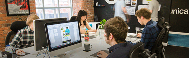
When you design, you think of your audience and the core message of what you will be telling them. This includes the text that is incorporated in the design. When selecting a font, you have to think of how the particular audience would respond to your text and if they are readable and easy to be followed through. The theme or the concept should also be kept in mind. Not only the design elements can impact people, but even the fonts. Therefore, one should be careful in font selection and even font color. Graphic design agency artists have an understanding of the fonts and the families, the mood associated, and the right treatment with them. Check this link https://www.sdesigngroup.com.au/ to find out more details.

Less is more
There would be times that a lot of ideas are bursting from your head that you would want to incorporate these all in your design, which includes the typography. This sometimes lead to a wide variation of fonts in a single blow which can be very confusing to the audience. To strengthen your design, don’t use too many fonts in your text, and as much as possible, select your font within the same family. You can also have fonts that either have serifs, or without, to be consistent. If you want contrast, you can have a headings font against a body text font.
Hierarchy
As mentioned, when you think of a good design, the audience must be considered. However, it is not only about selecting a font that is appropriate for the mood or that conforms to the theme, but it is important. You must also know how to combine your font choices with how they are placed in the design. This stems down to prioritizing your texts. Guide the audience in your design so that they will know where to read first, which texts are related to one another, among many others. When you have multiple articles, say in a brochure layout, be consistent with your heading fonts and body fonts to avoid confusion on the readers’ end.
Brand design agency in South Yarra experts master the layout techniques that can keep an audience more engaged to your articles.Typography must not be left out in your consideration when it comes to good design. Make sure that the text complements the design by keeping in mind the above guidelines.